Visibility
Utilization charts
A number on its own tells you about this second. A line tells you whether it is normal. This page answers the two questions people actually ask: is it coping now, and has it been getting worse.
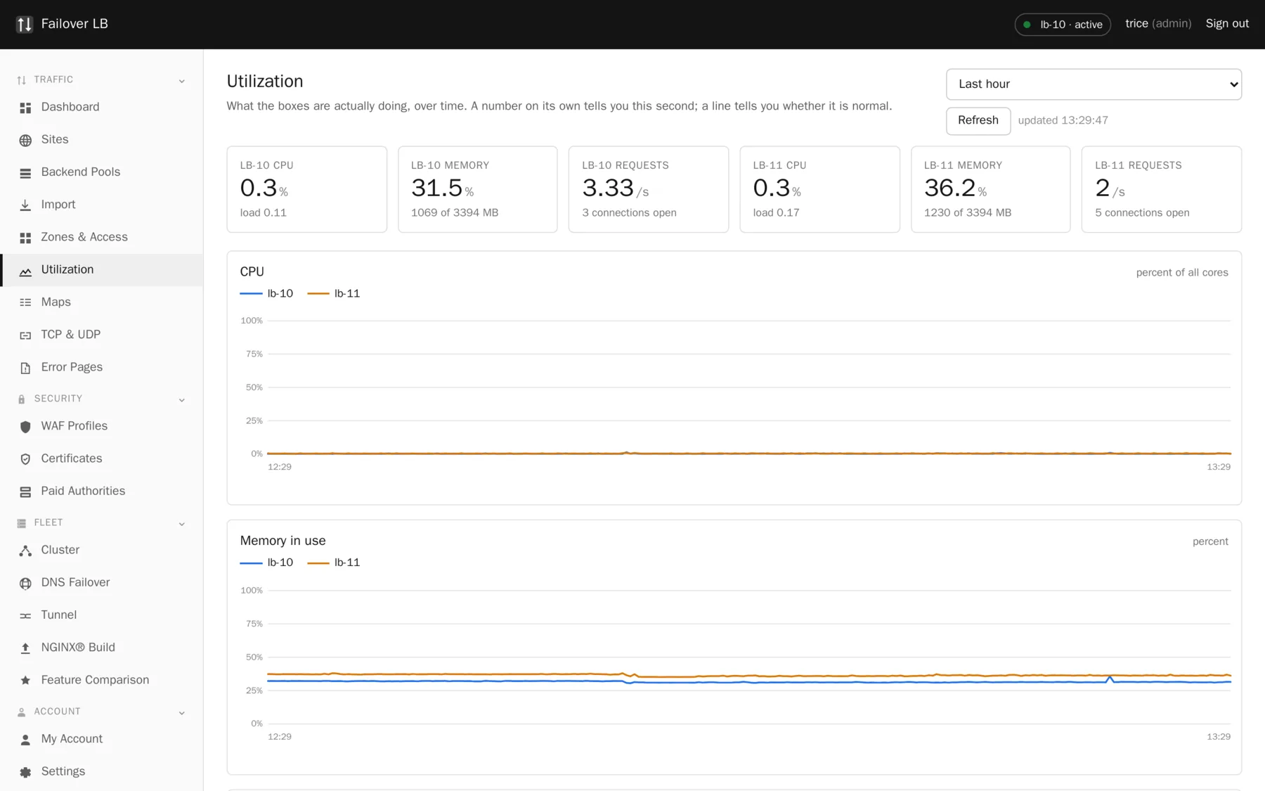
What is on it
| Chart | What it tells you |
|---|---|
| Requests | How much traffic is arriving. A sudden change here explains most of the other charts. |
| Connections | How many conversations are open at once. Climbing while requests stay flat usually means something is answering slowly. |
| Processor and memory | How hard each load balancer is working. |
| Backend servers | The same for the servers in your pools, when they publish it. Hidden when there is nothing to show. |
Windows run from the last fifteen minutes to the last thirty days, so you can look at what is happening now and at whether last Tuesday was worse.
Where the backend numbers come from
The load balancer has no login on your application servers and does not want one. Holding a password for every machine in the estate would make this the most valuable box on your network, which is a much bigger risk than a chart is worth.
Instead it reads numbers your servers already publish, if they publish any. Many do without anybody
setting it up. Put the address pattern in the pool settings, using {host} where the
server address goes, and the charts appear. A server that publishes nothing is simply not measured
and the page says so rather than guessing.
A gap is drawn as a gap
A hole in a chart means no measurement was taken then, usually because something was restarting. It is drawn as a gap and not as zero, because zero would read as the server being idle when it was actually being restarted, and that is the sort of small lie that costs somebody an hour.
What this is not
It is not a live activity dashboard
NGINX Plus has per server zone and per upstream numbers updating in real time, including requests still in flight. This scrapes stub_status on a timer, which gives connection level numbers with history behind them. On the comparison page we score three out of five for live monitoring against five for Plus, and that is a fair score.
What we score higher on is the other half: processor, memory and load over time, for the load balancers and the backends. Plus does not do that at all, because it is a proxy rather than a monitoring system.
Common questions
How often is it sampled?
Every fifteen seconds for the nginx numbers. Rates are worked out between two samples, so they take half a minute to appear after a restart.
Does this replace Prometheus or Grafana?
No, and it is not trying to. It is here so you can answer a question without leaving the screen. If you already have a monitoring system, keep using it.
Can I get the numbers out?
Yes, through the JSON API.
Step by step instructions
The how to section has searchable, task shaped answers. Search it for utilization.